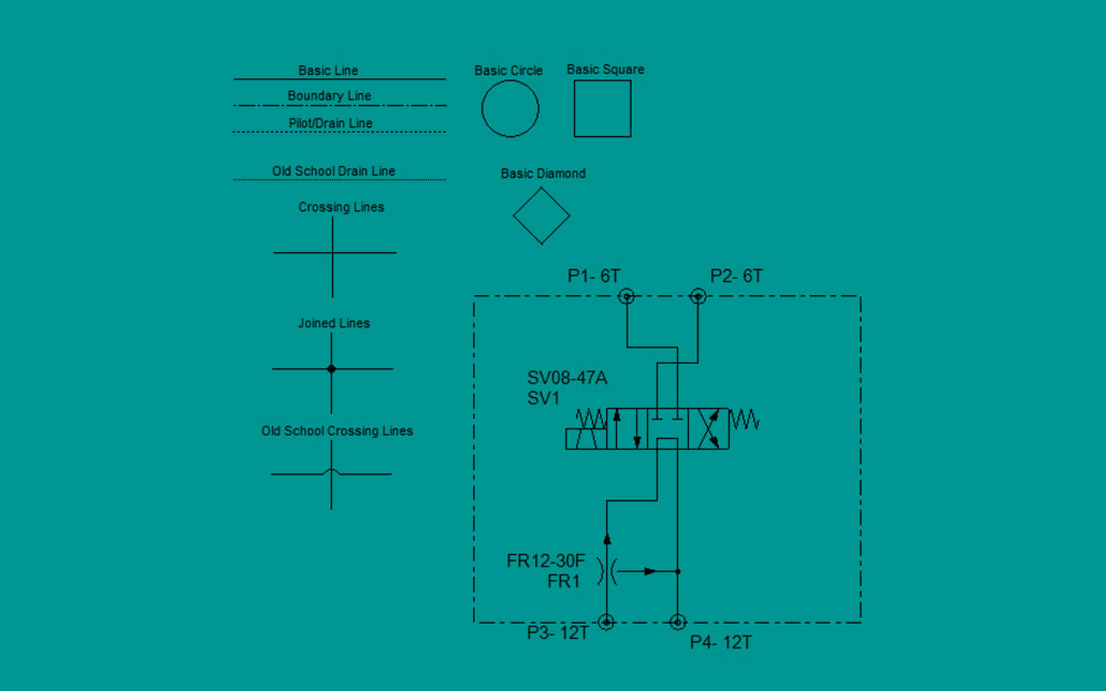
I love a good hydraulic circuit; one well organized, well laid out, with current symbology and with consistent symbol geometry. ISO offers their worldwide standard, 1219, in the drawing and application of hydraulic symbols for a machine schematic. Currently in the 1219-1:2012 iteration, there have been many updates to the code throughout the years, especially with the integration of electronics into hydraulics.
Why all machine manufacturers do not adhere to these drawing standards is beyond me. I suppose I’m a bit of a stickler, but there is nothing worse than a high school level drawing on a brand-new, million-dollar machine. I’m exaggerating, as I also suppose zombies and brussels sprouts are worse things than poor drawings. That’s right, I don’t like brussels sprouts; the smell of them is how you know when other food has gone bad.
But I digress. Also, don’t get me wrong, because I’m not concerned with schematics drawn on scrap paper to explain a concept, or with drawings done by non-professionals to show someone what they’re looking for. I am concerned with actual professionals, like engineers and draftspersons, whose only job is to design hydraulic systems or create the drawings for those hydraulic systems.
Here are some problems I have with the drawing of hydraulic schematics:
- Using of the “line jump” semicircle to show two lines that cross but not join. The current standard is to just make the lines cross. Joined lines require a dot or “node” at the point of intersection.
- Inconsistent sizing of components. For example, a relief valve square should be the same size of any of the three squares in a 4/3 directional valve symbol. I often see pressure valves drawn so small as to be able to entirely fit within one of those directional valve squares.
- Non-solid-filled nodes, arrowheads, pilot-triangles etc. Not only does the schematic look better with solidly filled sub-symbols, but sometimes not filling them implies a pneumatic symbol, such as with a piloted valve.
- “Propriety” symbology, such when a machine manufacturer or other organization thinks their symbol looks prettier than the standardized symbol. Standards exist for a reason, and luckily this practice is rare these days.
For the most part, symbols look enough the same even when creatively drawn, so that anyone familiar with reading them can understand what’s going on. So as much as I love a good schematic, I love reading old drawings to see how they used to do it, and even if I disagree with their technique, I’d rather be reading a terrible hydraulic schematic than eating good brussels sprouts.

